Isometric Poster Design
This lesson teaches you how to create a poster that communicates the concept of Isometric Drawing.
Isometric Poster Design
Design a poster that communicates the concept of Isometric Drawing.
As a poster designer you must learn how to compose the main elements of the poster space in a visually articulate manner.
-
The main elements of a poster are its Imagery (images) and Typography (lettering).
-
The composition of these components is called the Layout.
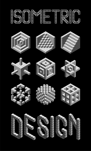
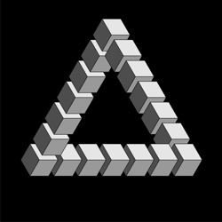
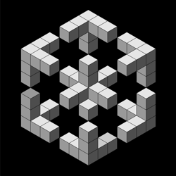
Isometric Imagery
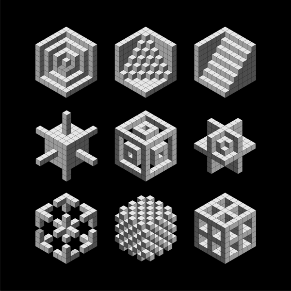
Isometric Forms
We developed our isometric imagery for our poster design in our previous lesson on isometric drawing.
-
Using the information and experience you gained from this lesson, decide on the images you wish to use for your poster design. This could be a single image or a combination of different images that show a range of isometric forms.
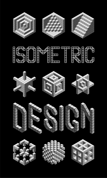
Isometric Typography
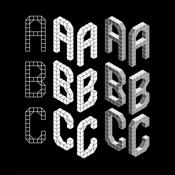
Typography is the style of lettering that you use for your poster design. Your choice of lettering is very important as different fonts have different visual qualities that will either enhance or weaken the impact of your poster. As our poster is about isometric drawing, we have designed a sympathetic isometric font which will sit in harmony with our images. You may download and print this free isometric alphabet to use with your poster.
Each letter of our alphabet has three different typefaces. These show the development of the font from a 2-dimensional plan format to a 3-dimensional isometric projection:
-
The first is a two-dimensional plan view of the letter.
-
The second is a three-dimensional linear projection of the letter from two different angles (30° and 150°).
-
The third is a three-dimensional tonal projection of the letter from two different angles (30° and 150°).
Isometric Poster Layouts

- Slide Show
- isometric-design-poster.cdr
Layout No. 1
- isometric-design-poster-2
Layout No. 2
- isometric-design-poster-3
Layout No. 3
- isometric-design-poster-5
Layout No. 4
- isometric-design-poster-4
Layout No. 5
Layout is simply a process of trial and error to discover which combination of imagery and typography best communicate the concept.
-
Don't settle for the first layout you try. It is seldom the best one and often the most predictable.
-
The more you experiment with different layouts, the more you understand the communicative potential of your imagery and typography.
-
The posters in our slide show reveal some of the layouts we considered on the way to creating our design.
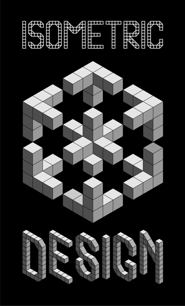
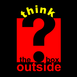
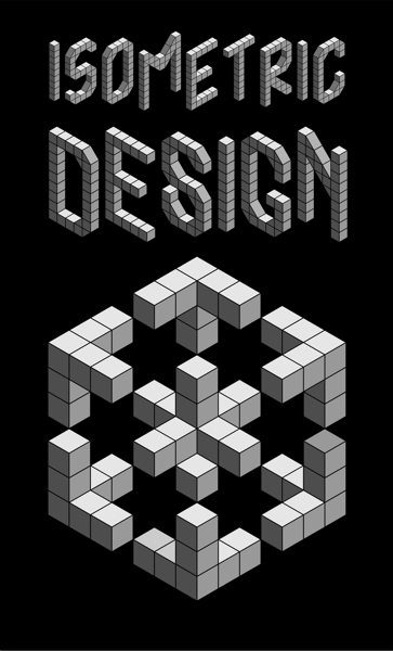
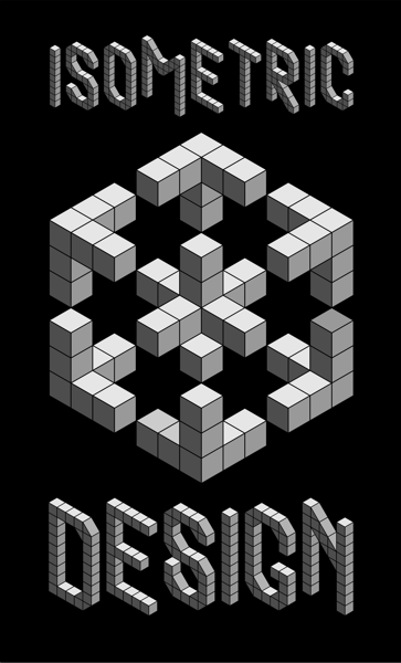
Final Poster Design
Our final poster design was selected for the following reasons:
Imagery
-
The arrangement of small isometric forms within the larger cubic format clearly illustrates the concept of isometric drawing.
-
The negative spaces between the forms subliminally act as star-shaped symbols of quality.
Typography
-
At the top of the poster, the 2-dimensional typeface introduces the subject which develops through the image to reach its isometric conclusion in the 3-dimensional lettering at the bottom.
-
This visual development mirrors the process of isometric drawing.
Layout
-
The top and bottom corner sections of the image point like arrows to the lettering, linking the imagery to the typography.
-
The image and type share a common width which helps their relationship.
