Graphic Design Lessons - A Short History of Logo Design
A logo is a sign, symbol, trademark or badge which conveys the identity or ownership of a product, company, campaign or concept in a memorable way.
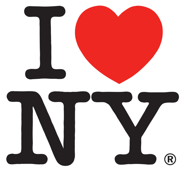
MILTON GLASER (b.1929)
'I Love New York', 1977
A logo is a sign, symbol, trademark or badge that conveys the identity or ownership of a product, company, campaign or concept in as memorable a way as possible.
How are logos used?
A logo can be used in many different forms, sizes and contexts. For example, the logo for a hotel could be printed on a letterhead or menu, embroidered onto a napkin or jacket, embossed on metal cutlery or illuminated as a huge neon sign on the side of the building.
What are the basic qualities of a good logo?
A logo should be simple so that it retains its clarity of design in different contexts. If it is too complicated, its details may be lost when it is reduced in scale. Also, a simple logo design is faster to read, easier to remember and consequently more instantly identifiable. The 'I Love New York' logo by Milton Glaser, one of the most reproduced logos ever, illustrates most of these basic qualities.
What is the main function of a logo?
A logo should convey an immediate and memorable identity and must connect with its target audience in a positive manner.
Logo Design - A Symbol of Faith
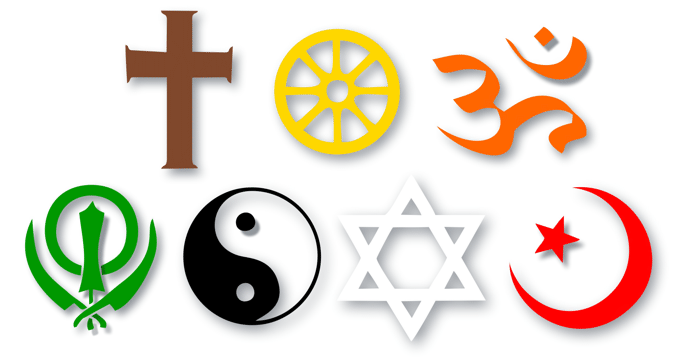
SYMBOLS OF FAITH
above: Christianity, Buddhism, Hinduism
below:
Sikhism, Taoism, Judaism, Islam
How have logos evolved?
Logos have been around in one form or another for several thousand years. The Ancient Egyptians are known to have branded domestic animals with hieroglyphs to mark their ownership. The Ancient Romans and Greeks marked their pottery to identify the manufacturer. The great faiths of the world have all adopted symbols for ease of recognition.
Logo Design - Identifying the Brand
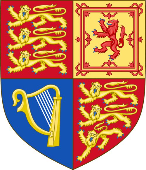
Royal Coat of Arms of the UK
From the 12th century onwards through medieval times, heraldic designs (coats of arms) were used to identify the status and property of the nobility.
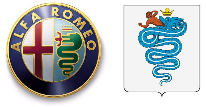
Alpha Romeo Logo and the Visconti Coat of Arms
The heraldic tradition continues to this day in logo design. The Alfa Romeo logo is the official branding of A.L.F.A (Anonima Lombarda Fabbrica Automobili) which is designed to represent the family coat of arms of the Visconti, one of the most influential and respected families of Milan.
Logo Design - A Mark of Quality
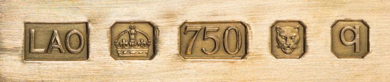
18 ct Gold Hallmarks from the London Assay Office
In general, the most common early logos were trademarks signifying the origin or quality of a craftsman's product. Hallmarks, which testify to the quality of precious metals, are a good example of this practice. The leopard's head has been the hallmark of the Goldsmiths' Company Assay Office since 1300.
Logo Design - Early 20th Century Vocabulary
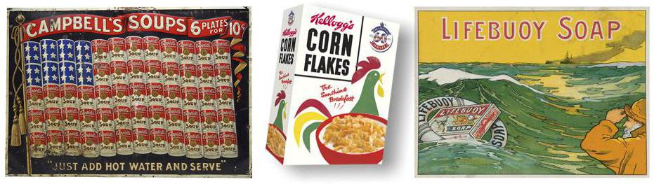
At the start of the 20th century with the introduction of color printing and the birth of the advertising industry, logo designs tended to use a vocabulary of national, nautical, heraldic, and agricultural images. The public readily understood the meaning of these symbols. National and heraldic symbols (crowns, flags and coats of arms) meant dignity and status while nautical, natural and agricultural symbols (seascapes, life buoys, birds, wheat stalks and farm animals) represented purity and freshness.
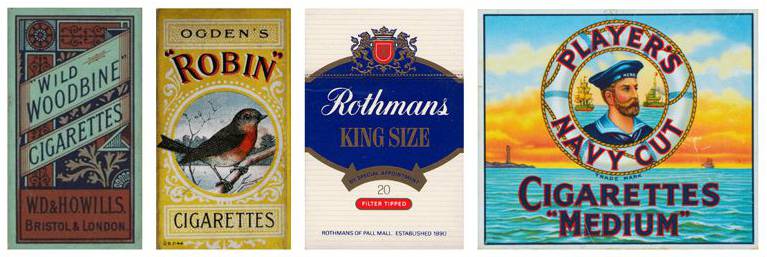
Unlike today, there was no concept of targeted advertising and designers freely used all these symbols to advertise any product. Cigarettes for example, before we understood their association with lung disease and cancer, used the full symbolic vocabulary to make their merchandise more 'appealing'.
Logo Design - Less is More
![]()
The Shell Logo (1900-2020)
Over the last century, our lifestyles gradually became more complex. Conversely, the design of logos became simpler for ease and speed of recognition in a faster world. The evolution of the Shell Logo throughout the 20th century clearly demonstrates this effect. The 1971 version, which was designed by Raymond Loewy and is still in use, has dropped its brand name as 'shell' is an English word that gets lost in translation in an international market. In short, the art of logo design illustrates the design concept "Less is More" better than any other graphic form.
Logos, as we know them today, are intelligent graphic images that are carefully designed to impart their concepts, both consciously and sub-consciously, for immediate recognition by a specific target audience.