Color Terms for Art and Design - 2
A knowledge of Color Terms helps us to understand how color is used in art and design. It also gives us the vocabulary to help express our feelings about an artwork or design.
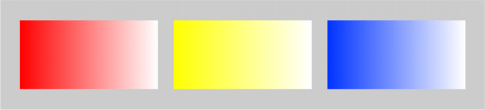
A tint describes a color that is mixed with white.
Color Shades
A shade describes a color that is mixed with black.
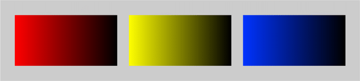
Color Intensity
Color intensity is the strength or value of a color.
-
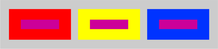
In our illustration, the three violet rectangles are identical colors but they appear to change when surrounded by different colors. Therefore, the intensity of a color changes in relation to the color that surrounds it. This effect is known as Simultaneous Contrast.
Transparent Colors
Transparent colors are colors that you can see through.
-
Paint is usually mixed very thinly to make it transparent.
-
Watercolor is the most transparent paint, but oil and acrylics can also be thinned for a similar effect.
-
Transparent paint is applied in what we call a ‘color wash’ in watercolor painting or a ‘color glaze’ in oil or acrylic painting.
-
When you overlay two transparent colors they will mix to create a third.
-
Different types of paint and certain colors are naturally more transparent than others.
Opaque Colors
Opaque colors are colors that you cannot see through.
-
Paint is usually mixed very thickly to make it opaque.
-
Oil and acrylic paint are the most opaque paints, but gouache is a type of watercolor also designed for this purpose.
-
Different types of paint and certain colors are naturally more opaque than others.
-
Titanium white is often added to very transparent colors to make them opaque.
Warm colors are said to be visually and emotionally exciting.
-
The red / yellow side of the color wheel is said to be warm, similar to the colors of fire. These colors appear to advance towards you and stand out more than other colors when viewed from a distance.
Cool colors have a more calming effect.
-
The green / blue side of the color wheel is said to be cool, similar to the colors of ice. These colors appear to recede and fade into the distance.
A knowledge of how warm and cool colors work is useful when arranging colors in a landscape to create the illusion of distance. This illusion is called Aerial Perspective.
Tone
Tone is the lightness or darkness of a color.
-
Tone is used to suggest the effect of light and shade and to create the illusion of 3D form.
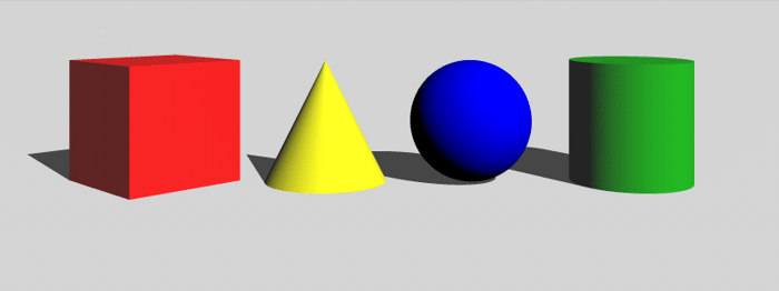
Matt and Gloss Colors
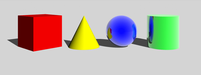
Matt and gloss are terms refer to the reflective qualities of color.
-
The matt color of the cube and the cone creates a dull non-reflective surface.
-
The gloss color of the sphere and cylinder gives a brighter reflective finish.
-
Artists mix mediums ( turpentine, linseed oil, acrylic emulsions) with paint to alter its matt or gloss effect.
-
A balance of matt and gloss effects on the surface of a painting could be a desired effect, but usually artists like to even out the sheen of the surface by applying an overall matt or gloss varnish. Not only does this unify the color and surface but it also protects the painting from dust and dirt.
Monochrome and Polychrome Color
Monochrome refers to the use of one color or various shades of one color in a single form. Polychrome refers to the use of many colors in one form.