Graduated Tones of Color

- Slide Show
- aerial-perspective-grid-colors
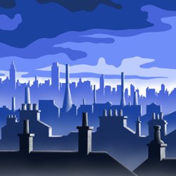
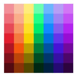
Graduated colors for aerial perspective.
- grid
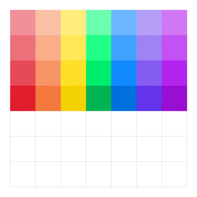
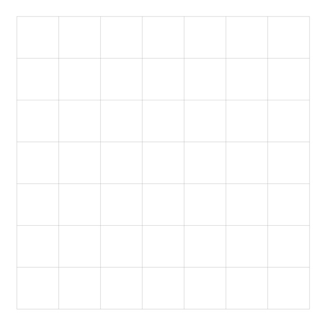
Start with a grid that measures 7 X 7 units.
- grid-colors
Paint in the central row of squares using the colors of the spectrum.
- grid-color-mixing
Paint in the row above mixing a small amount of white with each color.
- grid-colors-light
Repeat this process until you reach the top of the grid.
- grid-color-mixing-dark
Paint in the first row below mixing a small amount of black with each color.
- aerial-perspective-grid-colors
Repeat this process until you reach the bottom of the grid.
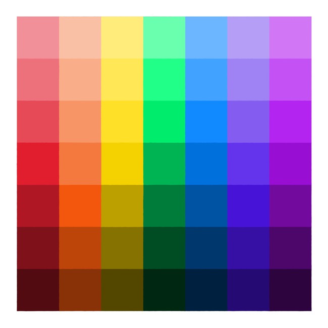
Before you start painting your landscape, you should practice mixing scales of colors with graduated tones. Our illustration above and instructions below outline a simple format to help you.
-
Start with a grid that measures 7 X 7 units.
-
Paint in the central row of squares using the colors of the spectrum.
-
Paint in the row above mixing a small amount of white with each color.
-
Repeat this process until you reach the top of the grid.
-
Paint in the first row below mixing a small amount of brown or black with each color.
-
Repeat this process until you reach the bottom of the grid.
Graduated tones of Color - Step 1
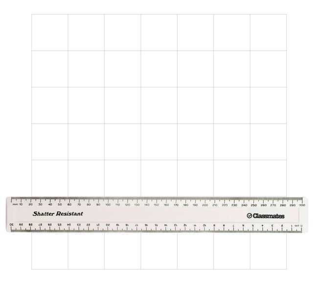
Draw a square grid (7x7 units) lightly in pencil.
-
Using the width of a 30cm ruler as the size of your squares is a quick way to lay out your grid without having to mark out the measurements.
Graduated tones of Color - Step 2
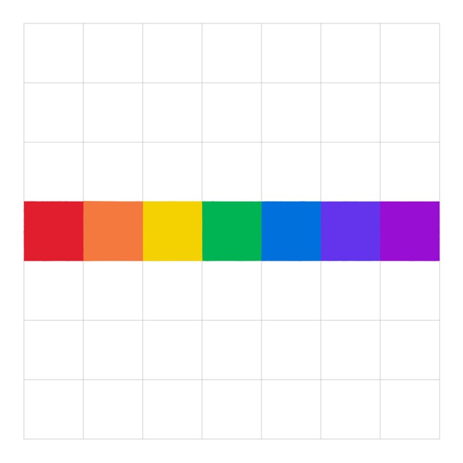
Paint in the central row of squares on the grid using the colors of the spectrum.
-
Each of these is a key color which you will lighten and darken to create a scale of that color.
Graduated tones of Color - Step 3
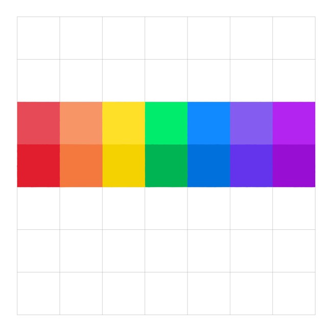
Mix a small amount of white with each of the colors and paint the row above.
-
The resulting row of colors should be one tone lighter than the preceding one.
Graduated tones of Color - Step 4
Repeat Step 3 on each successive row until you reach the top of the grid.
-
Now each of the rows in the upper half of the grid should be one tone lighter than the preceding one.
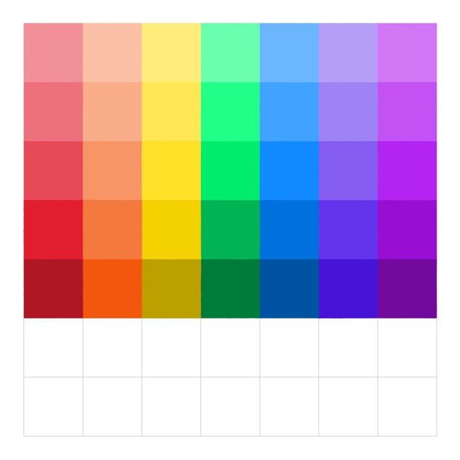
Graduated tones of Color - Step 5
Mix a small amount of brown or black with each of the key colors and paint the row below.
-
The resulting row of colors should be one tone darker than the preceding one.
Graduated tones of Color - Step 6
Repeat Step 5 on each successive row until you reach the bottom of the grid.
-
Now each of the rows in the lower half of the grid should be one tone darker than the preceding one.
Aerial Perspective Drawing - Step 7
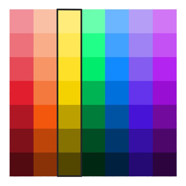
Once you complete the grid you should find that each vertical scale consists of seven graduated color shifts from dark to light.
-
Choose one of these color scales to represent the fading tones of aerial perspective in your landscape painting, using darker tones in the foreground growing lighter towards the background.
-
Note that the mood or atmosphere of your painting will depend on your choice of color, with the blue/violet end of the spectrum being cooler and calmer, and the red/orange end being warmer and more intense.