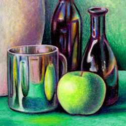
Still Life Techniques - Oil Pastels
Teach yourself how to draw a naturalistic still life using oil pastels on paper.
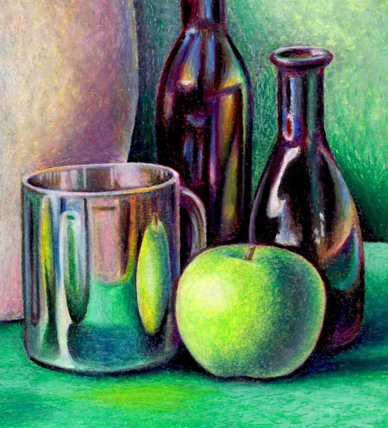
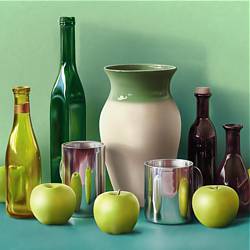
This step by step still life lesson will demonstrate the techniques used to create a still life with oil pastels on cartridge paper.
Steps 1 to 6: These steps demonstrate how you should establish the basic shapes, tones and colors of the still life.
Steps 7 to 10: These steps illustrate how to adjust the colors and tones to increase the dramatic impact of the still life.
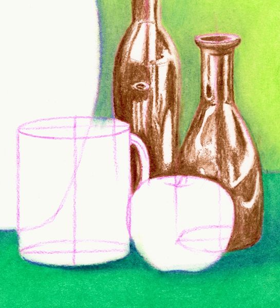
Step 1: Draw the objects in line
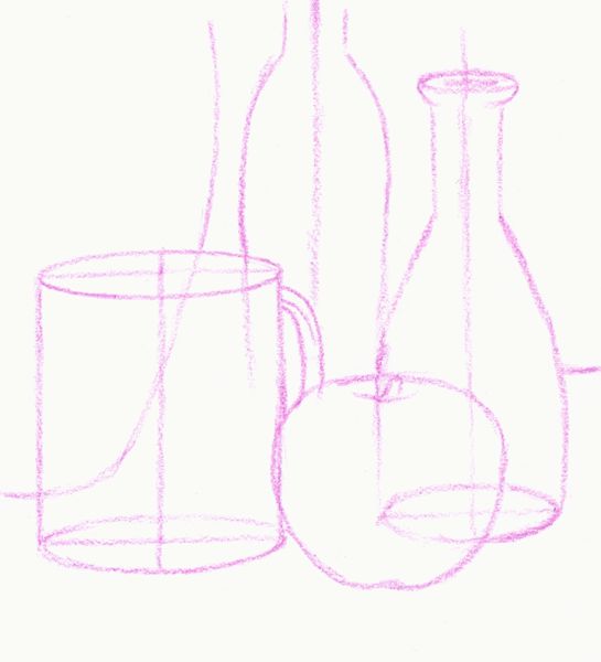
In any still life, you should start drawing the objects as if they are transparent wire frame forms.
-
This approach helps you to be fully aware of the shape of each individual form and its position in relation to the other forms.
-
This see-through drawing technique also uses vertical and horizontal lines of construction to help you to draw convincing ellipses and to balance the symmetry of cylindrical forms.
-
When you are working with oil pastels it is not usually good practice to start your drawing using a black crayon as it will contaminate the purity and freshness of any colors applied over it.
-
In this case the initial sketch was done in violet. After some tests it was found that most of the other colors in the box blended comfortably on top of the violet crayon.
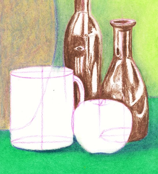
Step 2: Color the background and foreground first
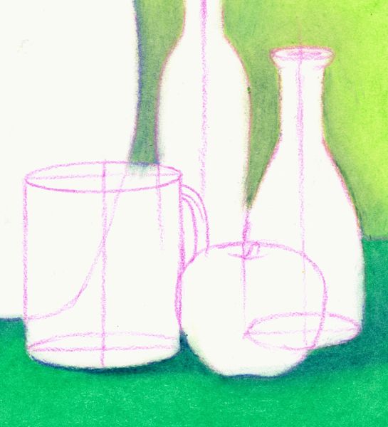
At this stage of the work, the foreground and background were loosely blocked in using a dark and light green respectively. A tissue was then used to soften the texture of the pastels and blend the color more smoothly.
-
Next some dark blue was lightly applied to create the areas of shade. Finally, the tissue was used again to blend the various colors together and refine the tones of the shadows.
-
When drawing a still life, you normally start with the nearest object and work towards the background of the group. However, when applying color in paint or pastels you reverse this process, starting with the background and working towards the front.
-
You will find that this method helps to improve the sharpness and accuracy of your work as you are always drawing the edge of an object over its background. This way there are no awkward gaps left between any object and its background.
Step3: Color the objects starting at the back
After applying color to the background and foreground you move on to the objects at the rear of the still life group.
-
A basic brown crayon was used to draw in the dark tones of the bottles.
-
The lighter tones and reflections were left as the white of the paper. Again a tissue was used to smooth out the rough texture of the crayon and blend the tones more gradually into one another.
-
Although it is not obvious in our illustration, it is helpful to lightly sketch the shapes of any shadows or reflections onto each object before you start applying the color.
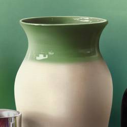
Step 4: Build up the color of the vase
The form of the large vase on the left hand side of the still life was built up with broad layers of yellow, red and blue. These colors were subsequently blended together with a white crayon. A tissue was then used to smooth and unify the overall tone to create the mottled effect of this color.
-
When you are building up layers of color on top of one another, do so lightly as an excessive thickness of the oil crayon will start to resist the application of more color. If this happens, use a palette knife to scrape off the excess crayon so that you can apply fresh color.
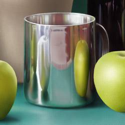
Step 5: Add the colorful reflections to the cup
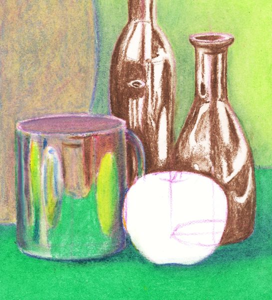
The distorted shapes of the reflections on the silver cup were carefully drawn from close observation but loosely colored, exercising care not to overdo the darker tones. These reflected colors and tones were mixed by various combinations of red, blue and dark green. The lightest tones, which were created without any white crayon, were achieved by allowing the white of the paper to shine through.
-
In an attempt to keep the color as fresh as possible, no black was used in the creation of the darker tones.
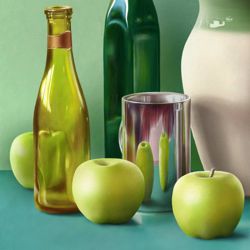
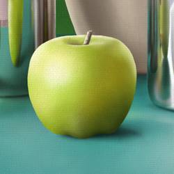
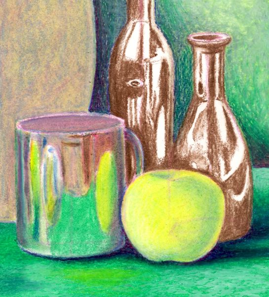
Step 6: Complete the basic colors and tones
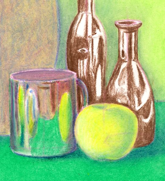
The final step in completing the basic colors and tones of our still life was to shade in the green apple. It was initially colored using a bright yellow which would establish a luminous foundation for the darker layers of green to be applied at a later stage. The areas of darker tone on the apple were suggested by smudging a light green into the yellow.
-
This step completes the application of the basic shapes, tones and colors of the still life. It is only once you cover all the major areas of white that you should to start to adjust and balance the colors and tones of the work to create a unified composition.
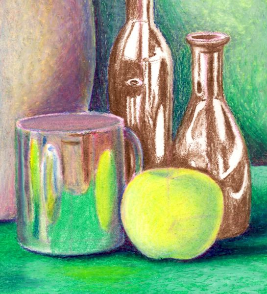
Step 7: Intensify the background tones
Once the basic colors and tones of a still life are established, they need to be adjusted to increase the expressive impact of the image.
-
We start this process by increasing the tonal contrast of the background and foreground.
-
In the background, a dark blue was blended into the green base color to deepen the darkest tones behind and below the objects. A layer of white was also applied to subdue the luminosity of the green. In the foreground the subtle variations of tone and reflected color were suggested with blended layers of white, blue and yellow.
-
The level of contrast that you establish at this stage sets the tonal key for the rest of the still life. All the objects must now be adjusted to that same level of contrast.
Step 8: Build up the form of the vase
Next, the form of the vase on the left is built up using a thin layer of white to strengthen its lighter tones and a blended mixture of red, yellow and blue to deepen its darker tones.
-
A small line of reflected light is highlighted down the right hand side of the vase to increase its contrast with the background.
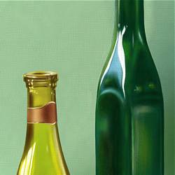
Step 9: Intensify the colors and tones of the bottles
Continuing the process of working from back to front, the colors and tones of the two bottles are now intensified.
-
Blues and reds are blended into the brown of the bottles to deepen the density of their dark tones, while a full spectrum of light colors including pinks, yellows, oranges, greens, blues and violets is used for their reflections.
-
Earlier we said that still life 'teaches you how to look at an object and see it like an artist - with a perceptive awareness of its outline, shape, proportions, tone, color, texture and form'. Once you begin to develop this 'perceptive awareness' you can begin to exaggerate some of these visual elements for expressive effect. For example, when our artist first looked at the two bottles he observed some very subtle hints of color reflected on their surface. He then exaggerated these subtle reflections by increasing the intensity of their color in order to enhance the visual impact of the bottles.
-
The different ways that artists edit what they see through this 'perceptive awareness' is what gives their work its individual style.
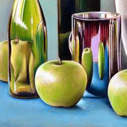
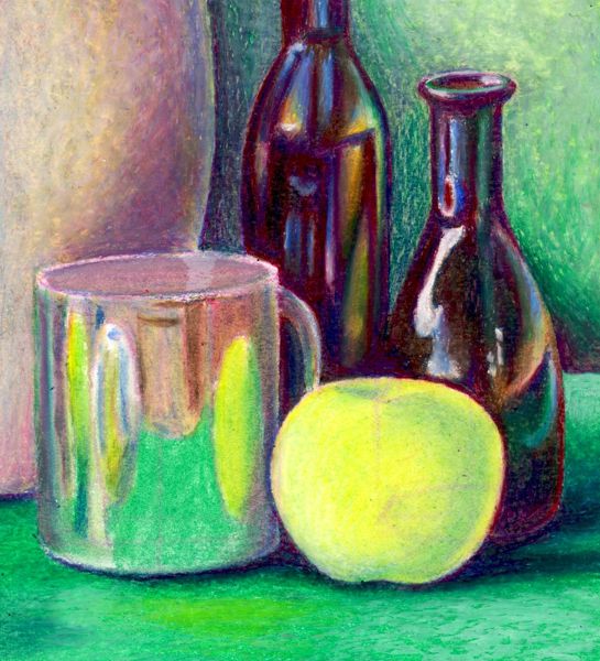
Step 10: Intensify and unify the remaining objects
To complete the still life, the tonal contrasts of colors in the silver cup and the apple are exaggerated by dramatically darkening the reflections and shadows on both objects. Various mixtures of blue, red, dark green and brown were blended to create the darkest areas of tone in these objects, while a little white was applied as highlights and to sharpen contrasting edges.
-
Finally, and for the first time in this still life, some small amounts of black were used to deepen the very darkest tones. It is always advisable to carefully limit the use of black to the final stages of a work as it easily overpowers the freshness and vitality of other colors.
-
When students first start to practice still life, their most common error is to understate the contrast of tones in a work. This is down to the technique of blending one color into another. They may start with the correct light and dark tones, but once they start blending their colors together, the light tones become darker as they mix with darker colors and the dark tones become lighter as they mix with lighter colors. Consequently the range of tones from the lightest light to the darkest dark is reduced and the impact you get from their tonal contrast is lost. What you need to do to remedy this is to exaggerate the differences between the light and dark tones before you start blending to compensate for the loss of contrast after blending.
-
Remember that in order to achieve a unified image, the level of tonal contrast that you are searching for must be balanced throughout the whole still life with each object adjusted to a similar tonal scale.